INVEB

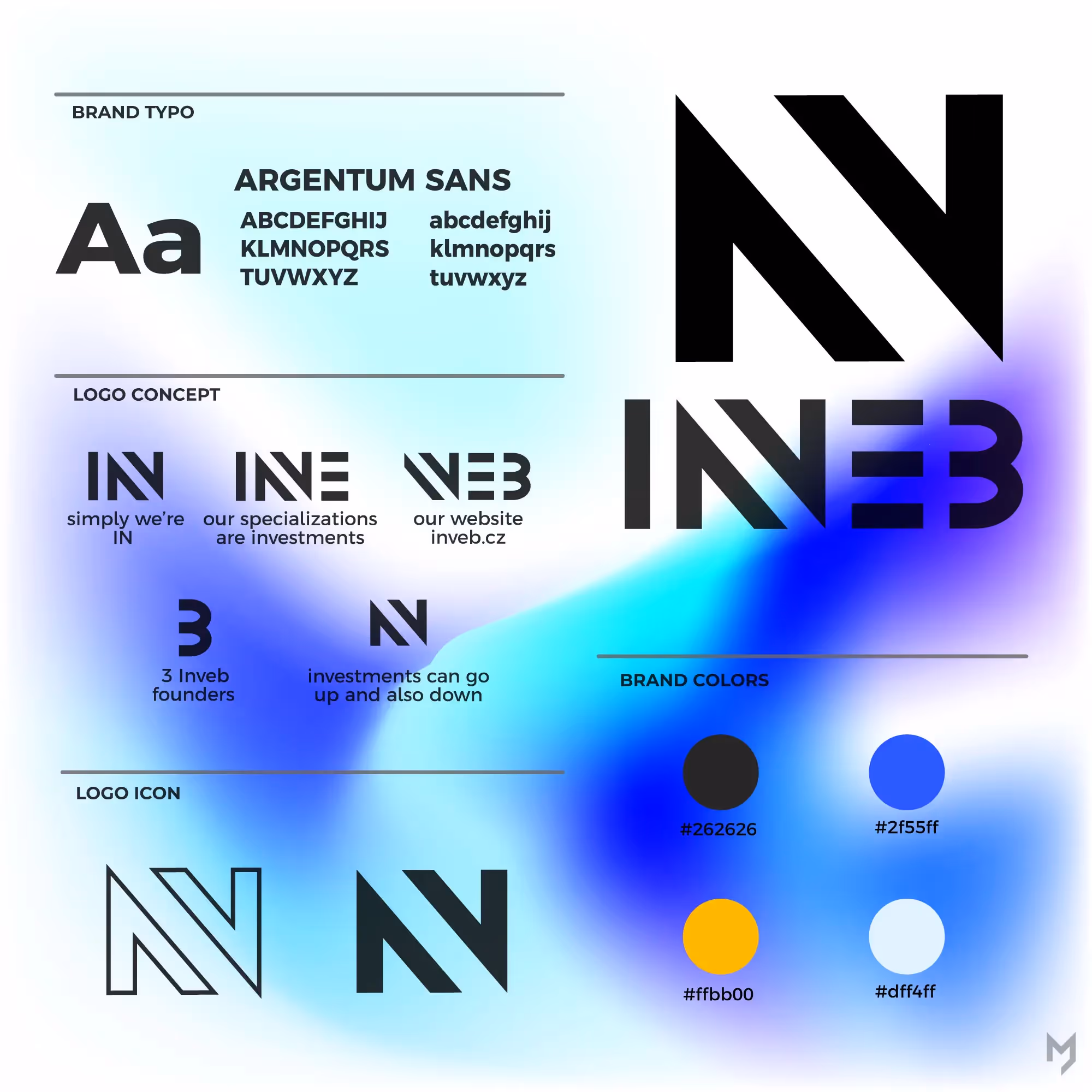
About three years ago, we decided to start a student project about investing. The idea was to create a platform where anyone can learn how to invest. The whole project is mainly based on educational videos. Together, we worked hard on this project. Coming soon. Here is the presentation of the project logo. The logo carries several meanings: In- the project was created by three young students, and “IN” fits naturally into student slang Inve- refers to investments, which are at the core of the project Web- the main platform will be our website 3- stands for the three founders of Inveb Finally, the logo also illustrates two opposing arrows, symbolizing the nature of the investment market (which goes up and down) The brand colors were chosen to reflect the identity of the city, which will also be a key element of the whole project. Yellow, for example, is typical of New York, home of the NYSE (New York Stock Exchange). Blue represents skyscrapers and modern architecture.